
Rebranding to Power Patient Outcomes
Clinical ink, Branding
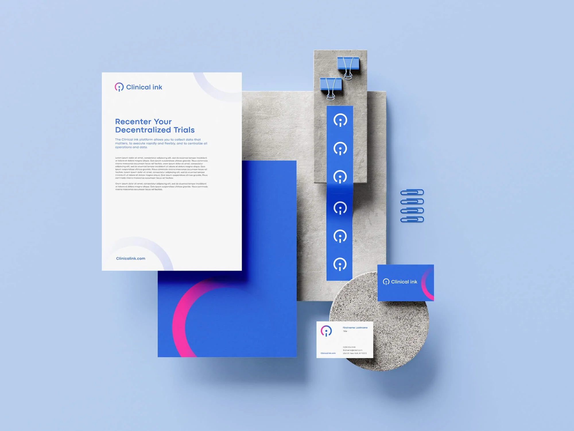
Clinical ink is the global life science company that brings data, technology, and patient science together. Their eSource clinical technology and configurable data collection modules capture and integrate electronic data at its source.
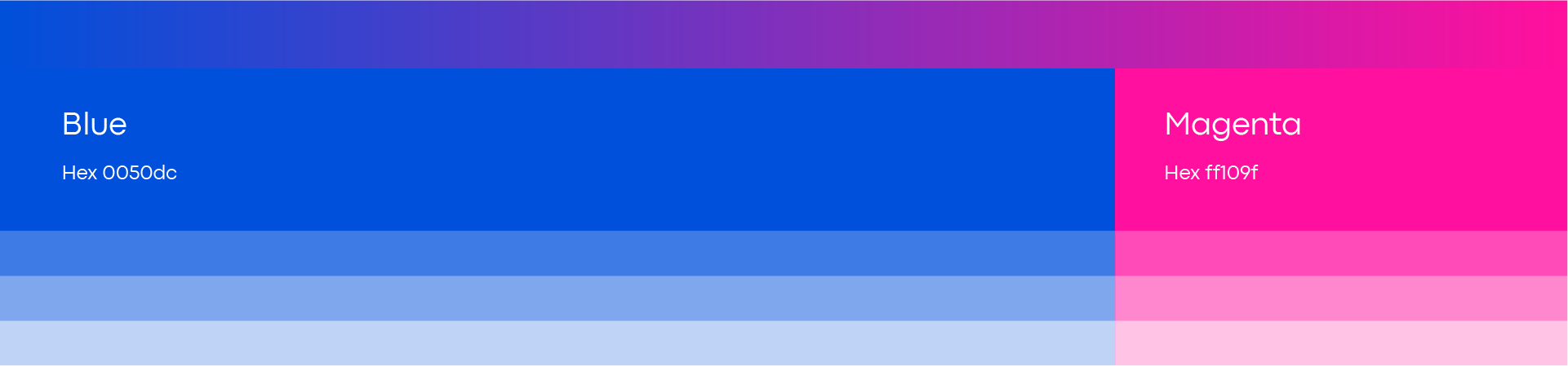
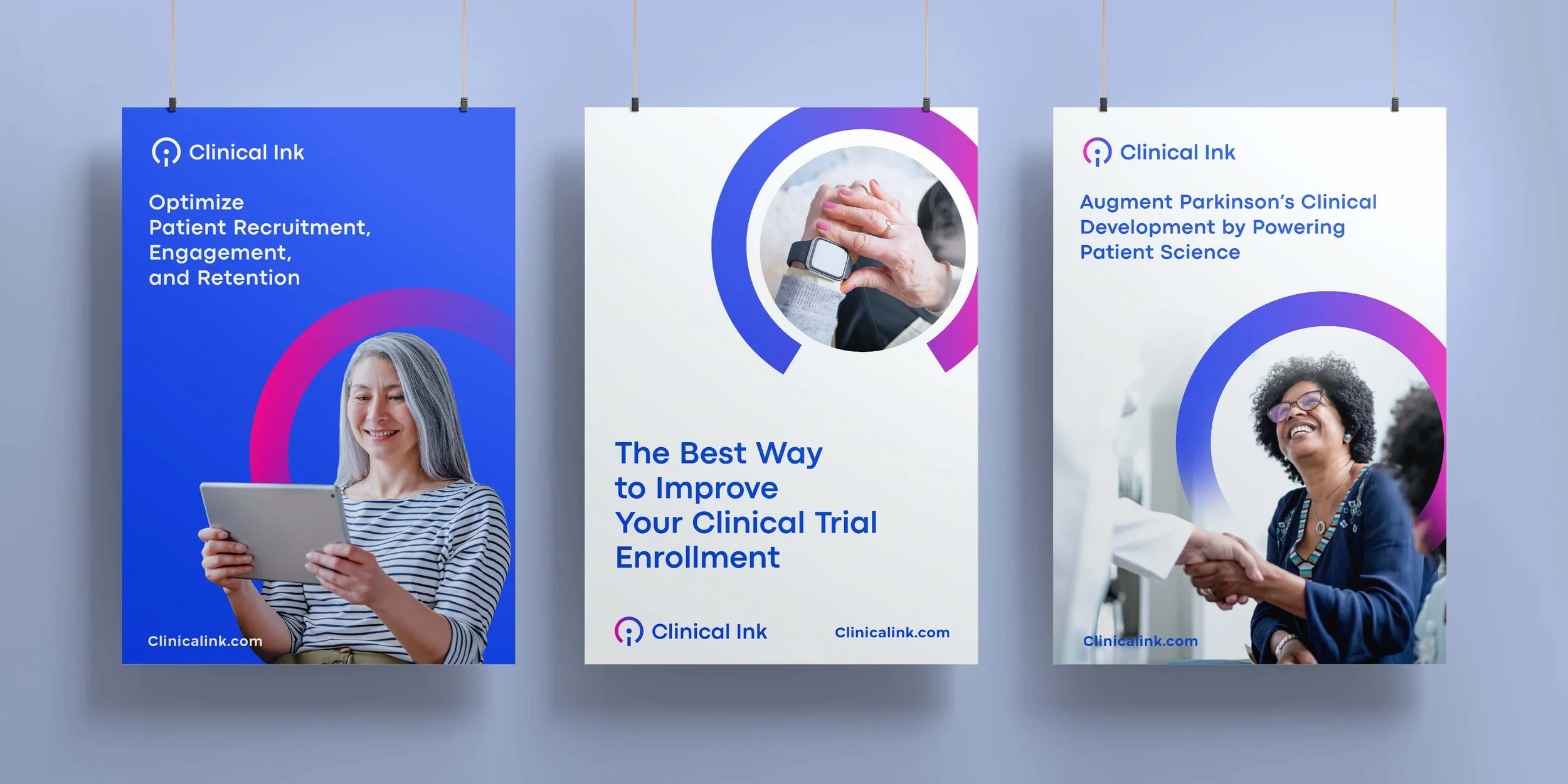
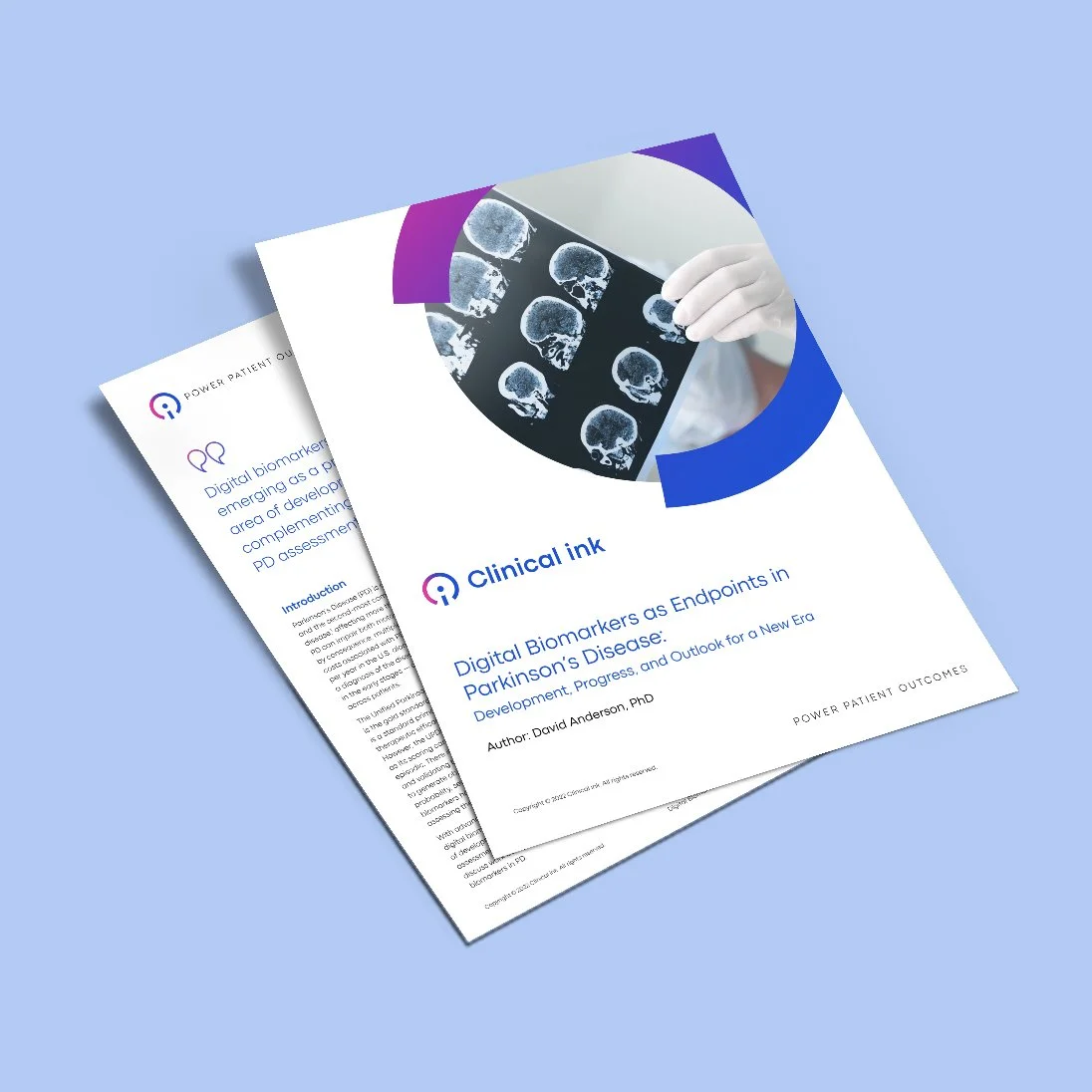
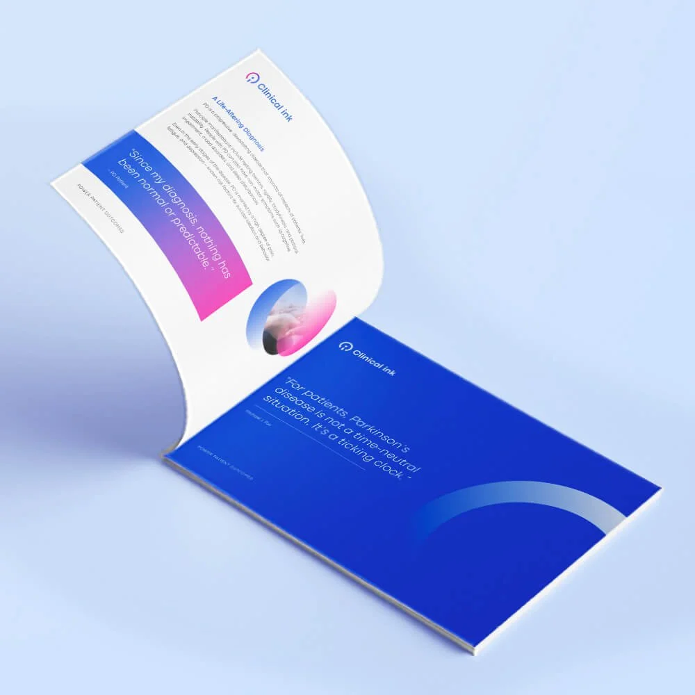
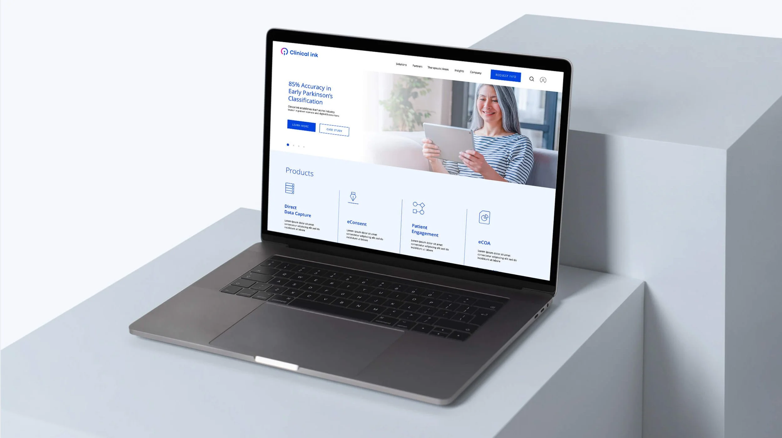
Clinical ink invited us to develop a complete project of repositioning and redesigning its brand and visual expression. Our work started with a learning phase, where our team interviewed some key stakeholders to understand the brand. The objective of the project was to create a visual language that conveyed that Clinical ink is patient-inspired, transparent, precise and progressive.
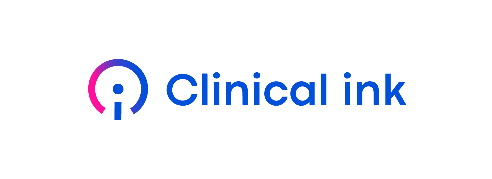
For the logo, a simplified representation of the human at the center built with the C and I. This symbol is also a play on powering up or powering humans playing on the company promise of ‘powering patients’. Symbol is kept simple to remain memorable and clean. Evoking a feeling of data centricity and a technological focus.
Timelines
Feb. 2022 – Apr. 2022
Design Team
Austin Lee, Creative Lead
Marco Velazquez, Creative Lead
Jiayu Chang, Designer


NEXT PROJECT
Rebranding the World Confederation of Billiards Sports for a younger audience
WCBS, Branding