
Rebranding the World Confederation of Billiards Sports for a younger audience
WCBS, Branding
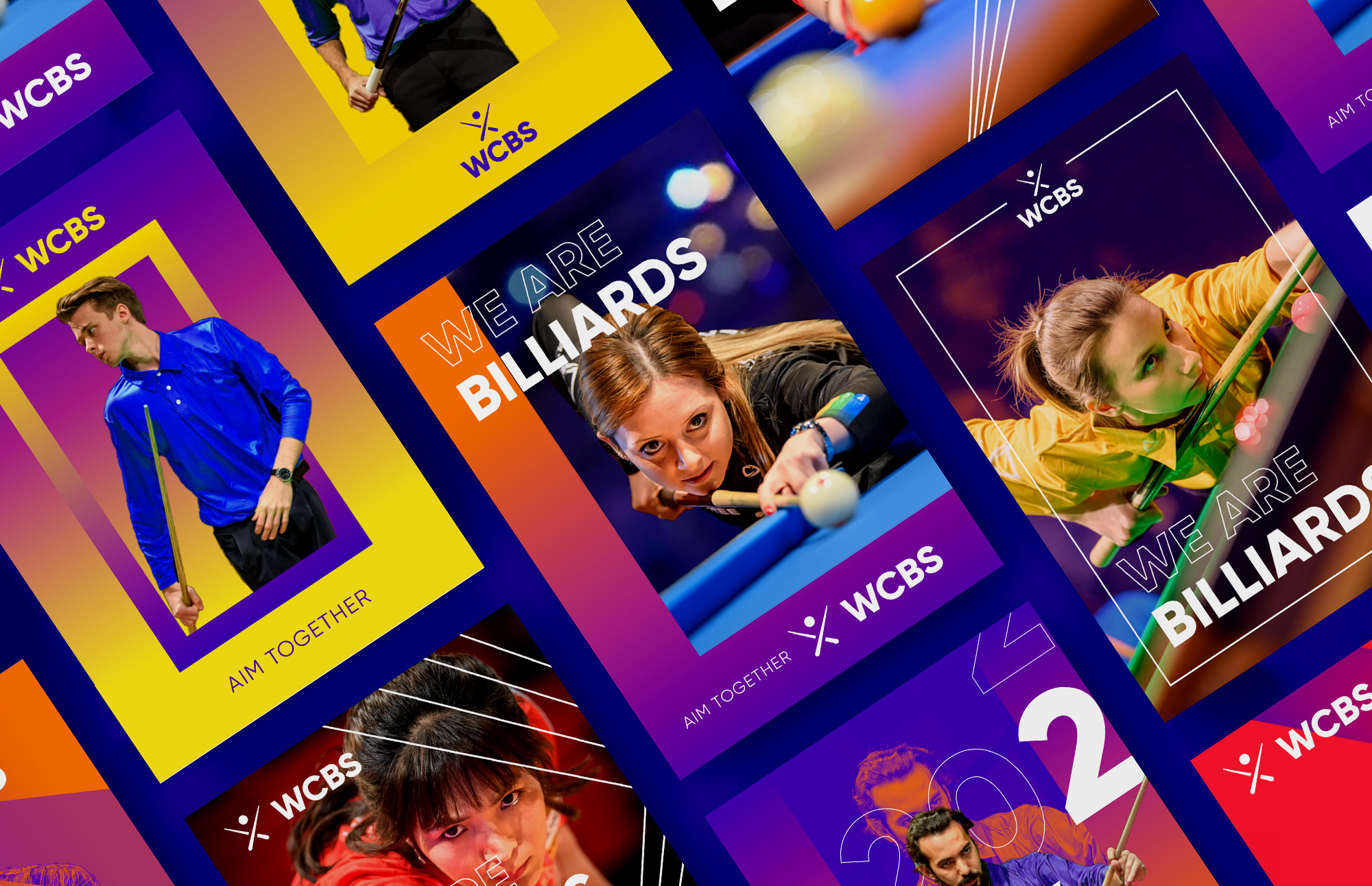
WCBS is the world governing body for the Billiards Sports of Carom, Pool, and Snooker. Their aim is to bring these sports to the Olympic arena and unite the global Billiards community.
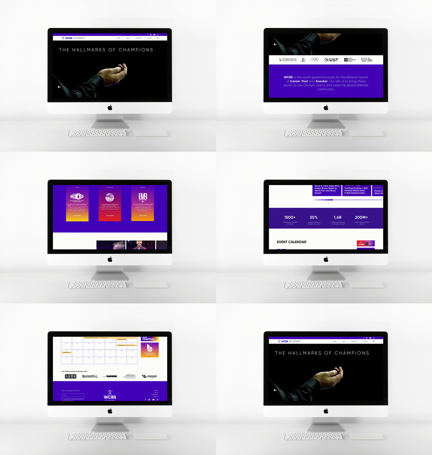
Founded in 1992, WCBS needed a new brand identity and a new website, as part of their plan pitching for 2028 Olympic Games participation.
Timelines
Feb. 2021 – July 2021
Design Team
Austin Lee, Creative Lead
Marco Velazquez, Creative Lead
Jiayu Chang, Designer

This logo celebrates Billiard’s rich history and heritage with straightforward and defined lines which come together personalizing the player and the sport as ONE. It is the “Unifying symbol” that establishes WCBS as a single leading entity for the sport. The elements of the logo represent the essentials and commonalities that unify all three disciplines of the sport – the cue sticks and ball.
Color Palette
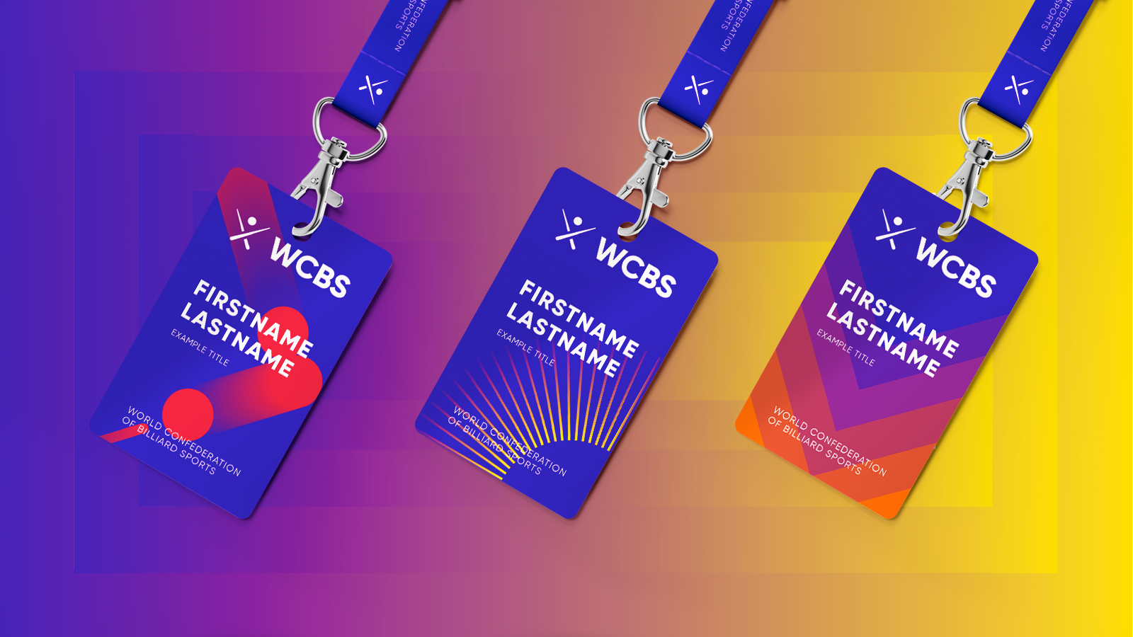
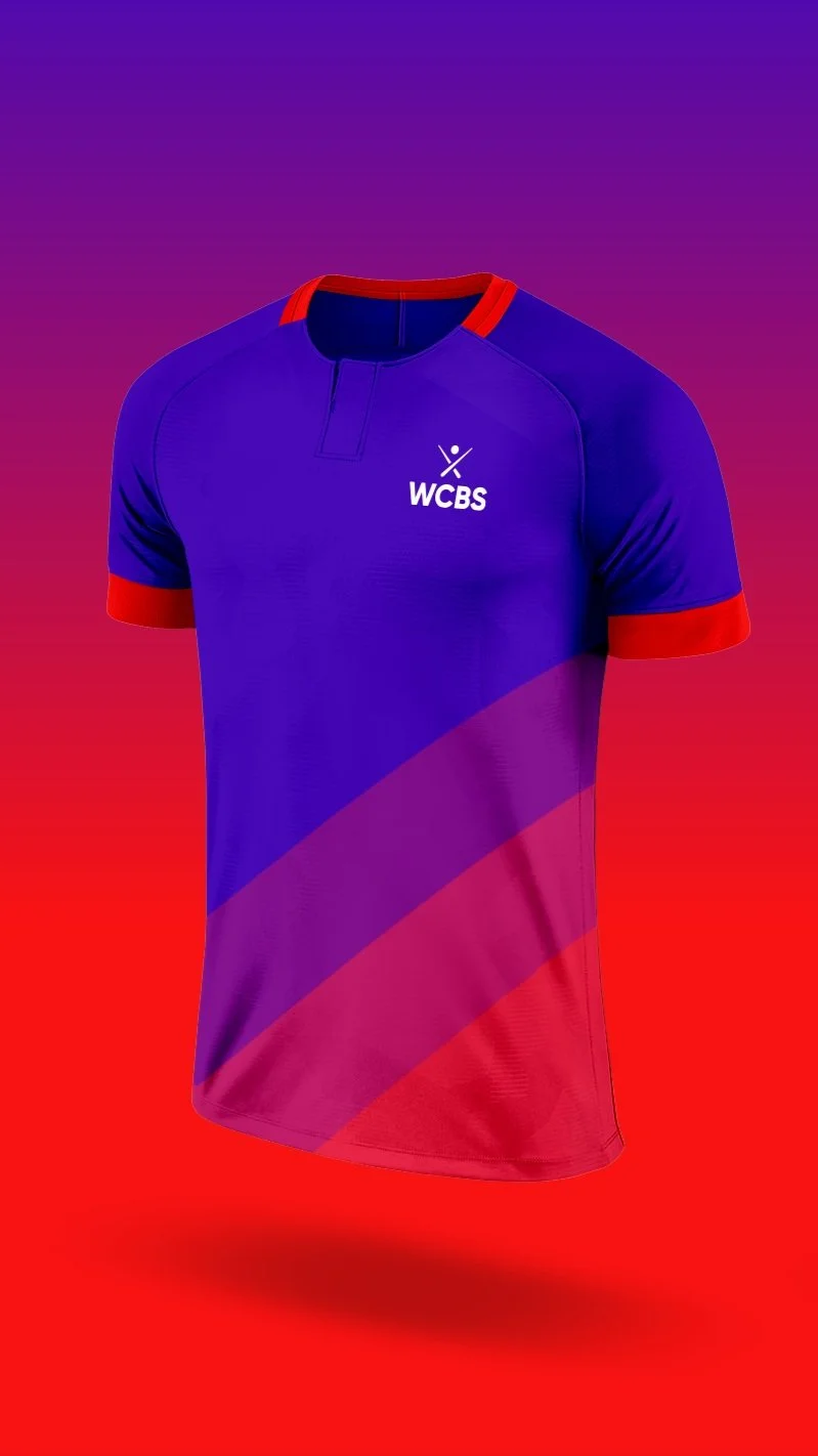
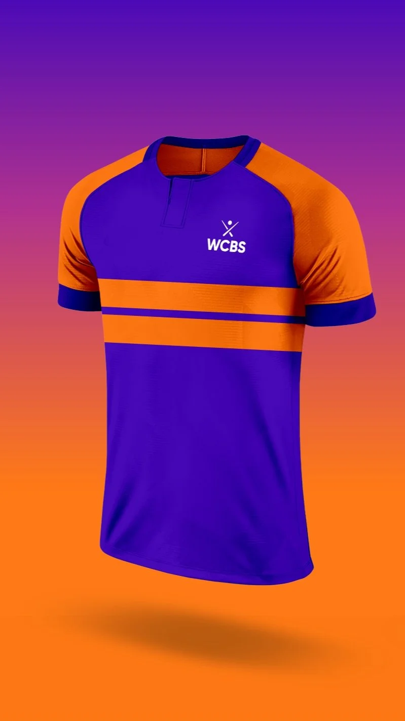
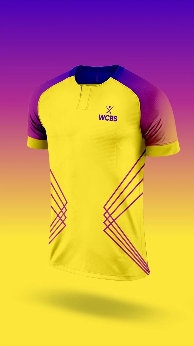
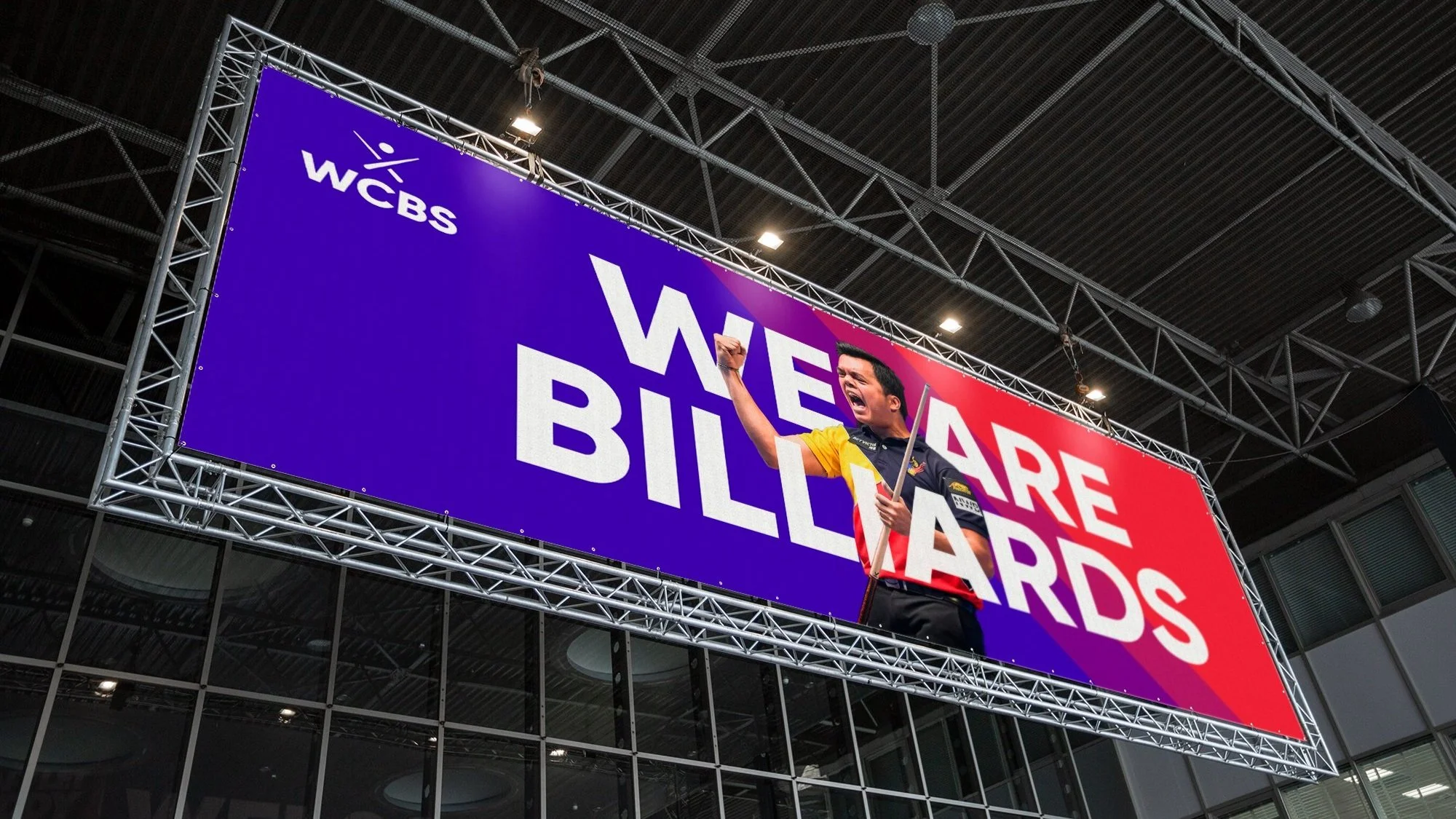
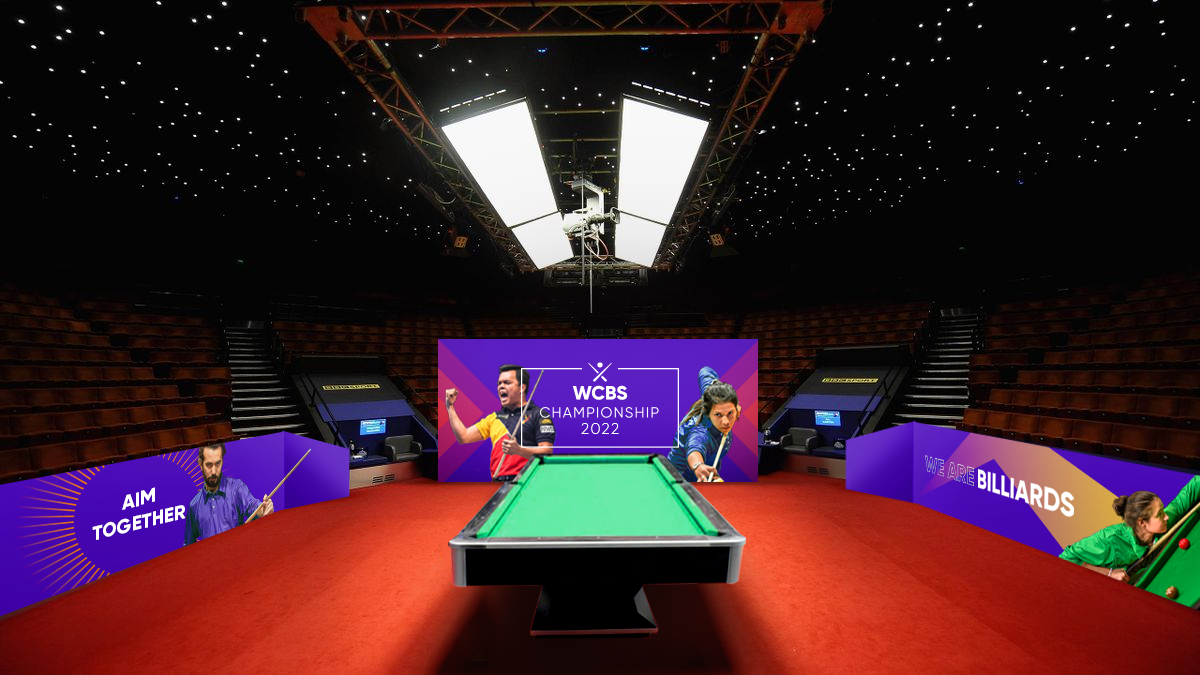
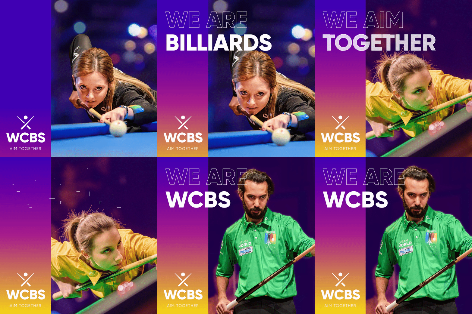
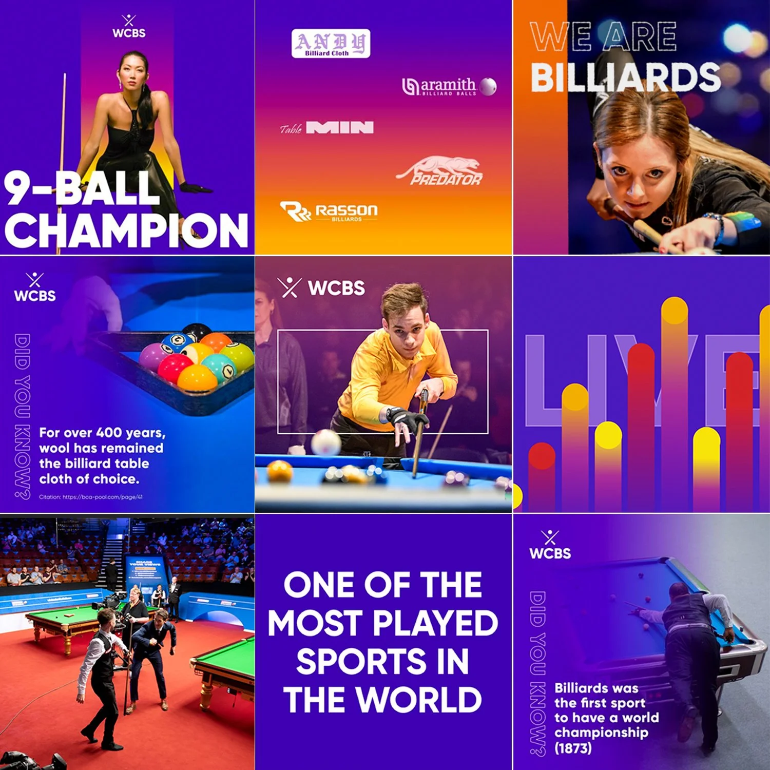
The purple-centric color palette was chosen for its symbolic meaning of unity as well as power. Unifying the three federations under a powerful brand color shows the strength of the combined federations. Red, orange, and yellow work as secondary colors. Each can be identified for the three individual federations—red for IBSF (Snooker), orange for UMB (Carom), yellow for WPA (Pool).



NEXT PROJECT