

Designing a Lead-gen Landing Page for Clinical Trial Professionals to Find the best Solutions They Need
Medidata UX / UI
Timelines
Aug. 2020 - Oct. 2020
Design Team
Austin Lee, Design Lead
Trevor Lewis, Digital Lead
Jiayu Chang, UX/UI Designer
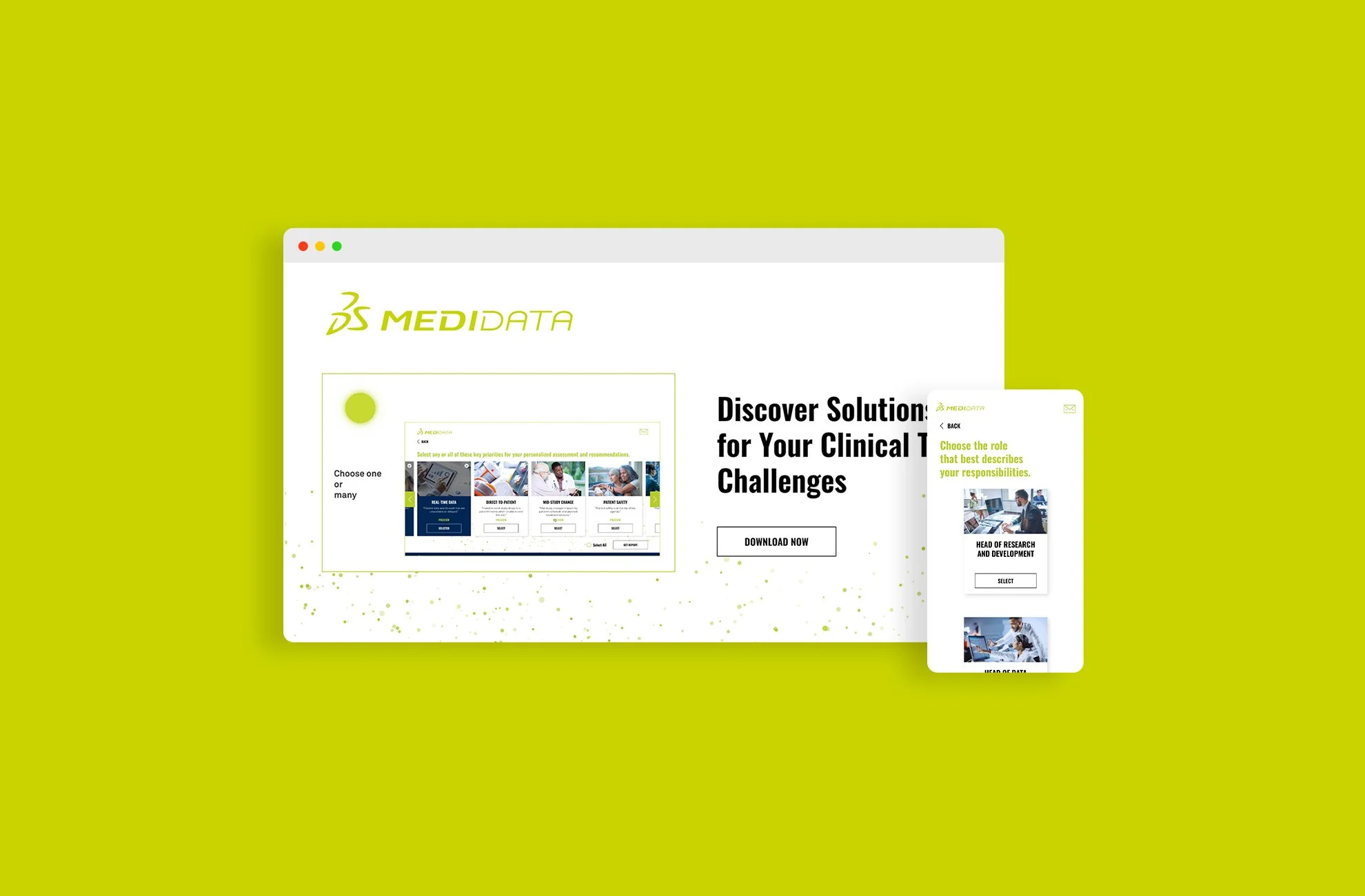
Medidata is technology company that develops and markets software as a service (SaaS) for clinical trials. Their main selling software, Clinical Cloud, is a unified platform of solutions that can help the professionals throughout the entire clinical trial process. The client approached us to design a lead-gen landing page for Clinical Cloud.
My Role
I was an UX/UI designer in the design team and reported to the Digital Lead. I was responsible for research, user flow, sketches, wireframing, UI design, and prototyping.
Understanding the Context
Insights from the clients
Business needs
Clinical Cloud includes many different solutions which help different professionals throughout the entire clinical research process. Medidata wants to educate the best solutions to different professionals and generate leads of them.
User needs
There are many solutions in the market and the professionals are familiar with the solutions they have been using. They don’t have time to look for a new solution and learn about how this new product can be better than the one they are currently using.
Challenge & Goal
The client’s initial goal to design a lead-gen landing page that targets different clinical research professionals and provides them with the Medidata solutions they need.
Research
To deeper understand the users, our design team had meetings with the client team and asked lots of questions. We also studied the client’s user research to understand the users’ working priorities, and how might Medidata solutions benefit their priorities.
Findings
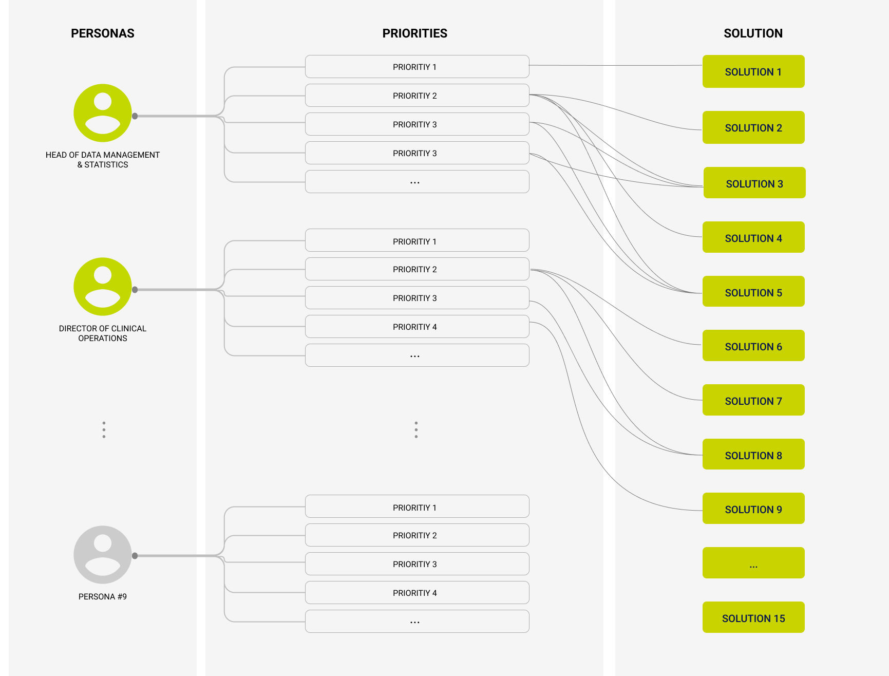
The landing page will target 9 major different personas. (such as head of data management & statistics, director of clinical operations)
Each persona has various working priorities. Some personas may share common priorities.
Clinical Cloud has 15 solutions. Medidata will suggest 1 or more solutions that will benefit each priority.
Design Goal
Working with the cross functional team, we framed our problems to bring focus into our design process.
“How might we help the users quickly find the Medidata solutions they need?”
“How might we make it joyful for users to fill out the contact form?”
Brainstorming and Research
We had a brainstorm session internally about the potential user experiences.
“With so many Medidata solutions, If we want the users to see only what they need, the experience has to be tailored to each user.”
Therefore, I did some research about how other websites customize the user experience for different users and took notes of what is doing good and what is not.
Guiding Principles
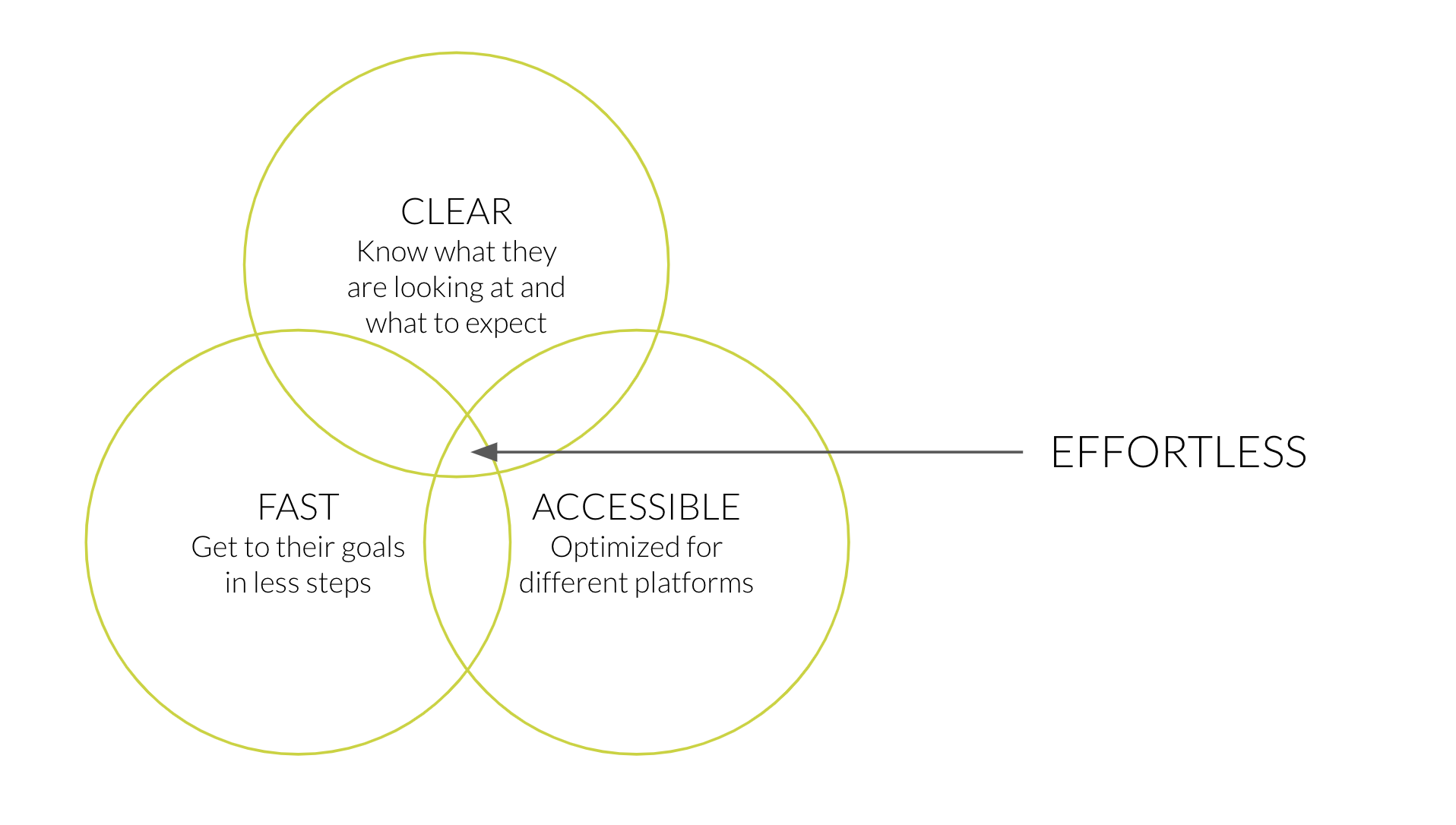
We felt that effortless experience is the key to success of this lead-gen landing page. In order to make the experience effortless for the users, the page has to be: clear, fast and accessible.

Design Exploration
Explored the User Flow
Sketch Exploration
Feedbacks from Design Team
Make individual page for each selection for easy click through.
Make good use of the space for content-heavy page.
Add solution preview section at the PRIORITY page can trigger users interest.
Contact form should come before the solution report.
Defined Site Flow
Design Ideation
I explored different design layouts for the important pages. Then I gathered feedback from designers, product owners, and developers during design critique sessions. I’ll be going into detail on the major iterations.
Persona Page
Full view of all the personas without scrolling
1 click to select, instead of 2 clicks
Use images to represent persona instead of icons
Priority Page
Full view of all the priorities without horizontal scrolling
Add SELECTED button to be consistent with the PERSONA page
Change DETAIL from a button to underscore link, more like a pop-up
Use images to represent persona instead of icons
Add SELECT ALL feature for easily selecting
Solution Preview
❌ Expand version
✅ Popup version
Has more space for content
Prefer having image for each priority
Report Page
Simplify this page by removing full information of the report; instead, the users can download the report PDF for the full information.
More Design Iterations

Final Design
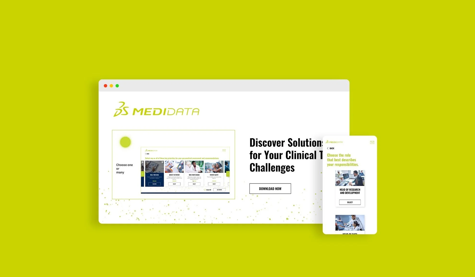
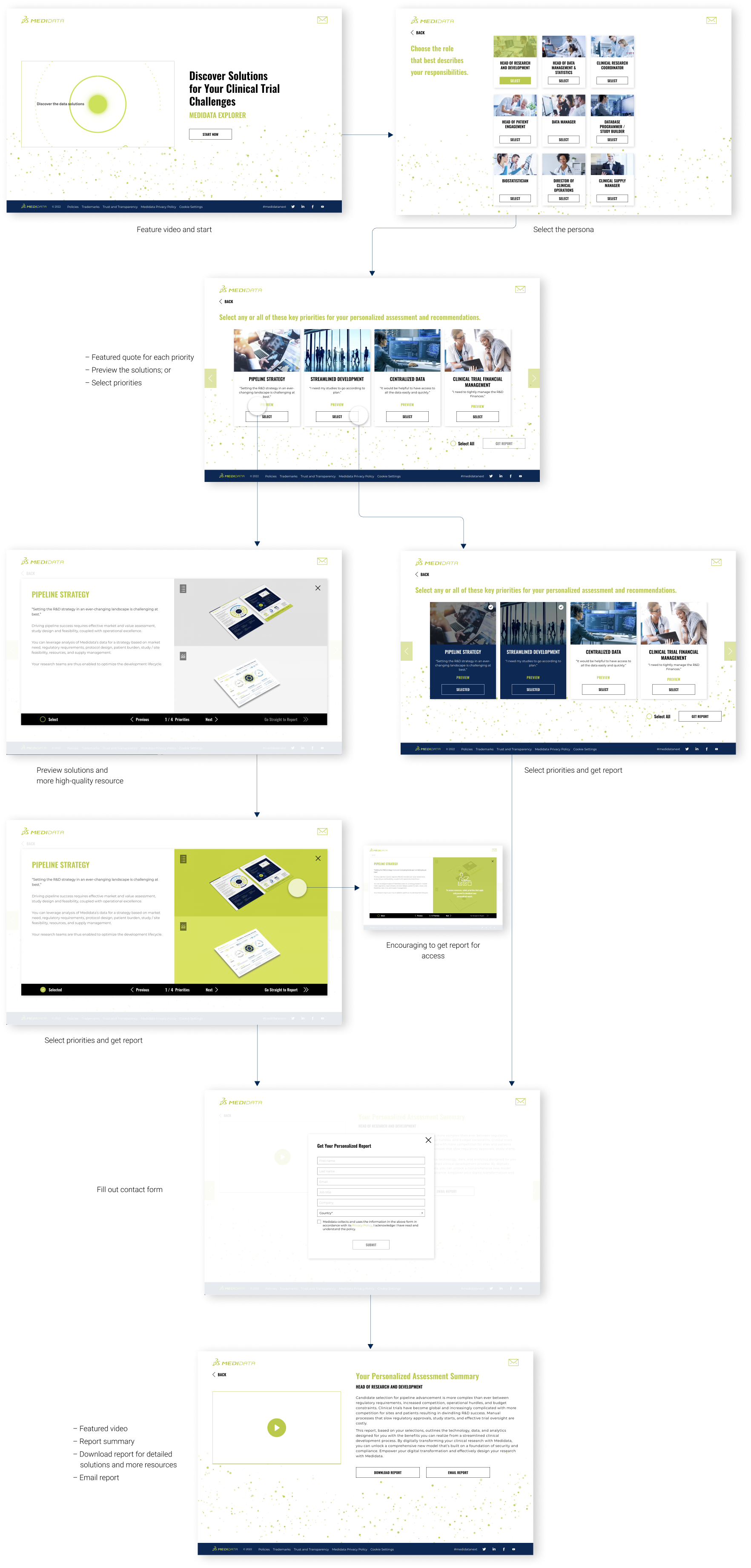
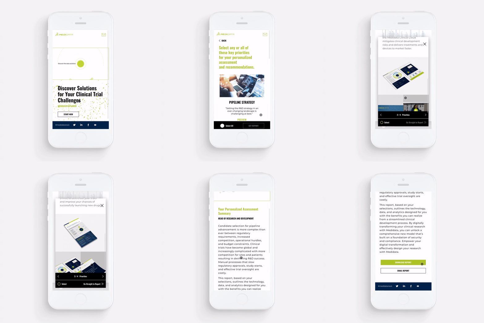
I also designed the mobile version and tablet version to ensure the best accessibility for different platforms.
Takeaways
Always fight for good UX
Working with multi-function teams for a big project, I got feedbacks from different perspectives, such as marketing needs and technology constraints. Thus, I needed to evaluate the feedback and found the common ground with the teams.
How to simplify the content
The project’s content is complicated and relates to an area that I am not familiar with. A designer’s responsibility is to simplify complicated things for the users. Thus I took lots of effort to study from the beginning and asked questions to understand the client’s product.
Potential Next Steps
Collect tracking results of the website and analyse what are driving the most leads and what aren’t performing well enough.
Run A/B Tests on different headlines, CTA or different priorities that fits user’s needs.
Continuously get more user feedback in both quantitative and qualitative ways.