

Redesigning a Billiard platform for the ultimate goal — having billiard sports included in the Olympic Games
WCBS, UX / UI
Timelines
Feb. 2021 - July 2021
Team
Jiayu Chang, UX / UI Designer
Austin Lee, Design Lead
Trevor Lewis, Digital Lead
Jamili Abraham, Copy Writer
The IOC now allows the organizing committees to propose new events, to attract the youth. There were 4 new games making their debut in the 2020 Tokyo Games and there is another new sport included in the 2024 Paris Games.
WCBS is the world governing body for the Billiards Sports of Carom, Pool, and Snooker. At the beginning of 2021, WCBS approached us and asked for rebranding their identity and website, as part of their plan to be included in 2028 Olympic Games.
My Role
I was a UX / UI designer in this project. I was responsible for user testing, sketches, IA, wireframing, UI design, and prototyping. And I participated in pitching and presenting design solutions to the client.
I developed the design principles and style guide after discussing with the design team and stakeholder. The users enjoy using the new website more, as we observed the overall experience rate increased by 60%. And the task completion rate increased 25% compared with the old website.
Challenge & Goal
WCBS was founded in 1992. Since their founding, their brand identity and website have not changed. They wanted to redesign their website to make a new and lively online presence.
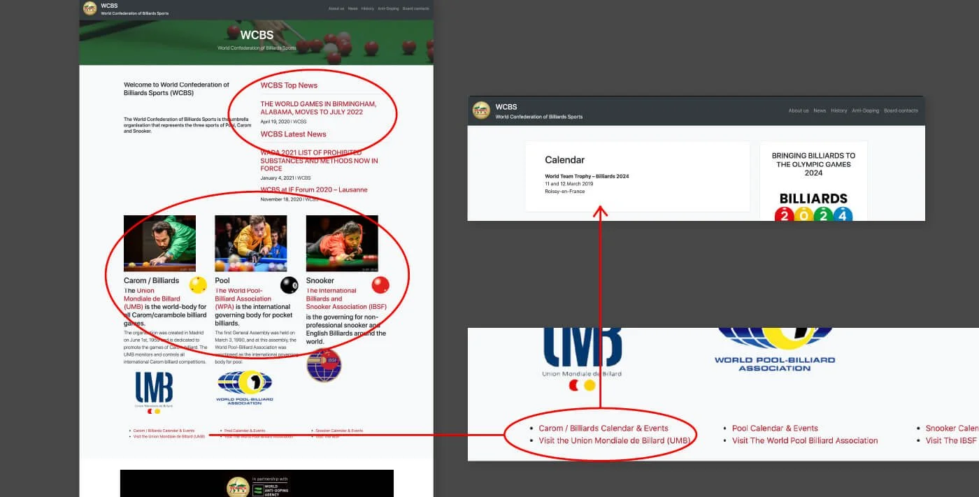
To understand the problems deeper, we started researching and conducting usability testing on their current website.
Research
Usability Test: What is Users’ Current Experience on the WCBS Website?
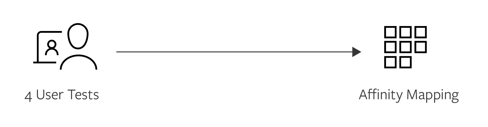
I conducted a usability test with 4 young adults between the age of 20-30, the targeted demographic for this website, to learn about their experience with the current website.
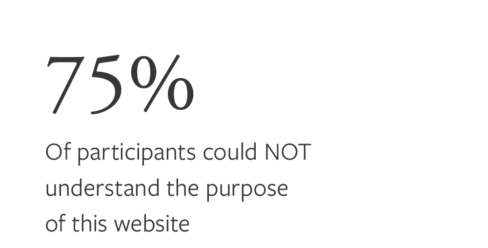
01. Data shows that users have difficulties using the website
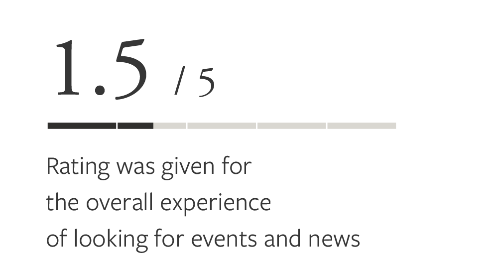
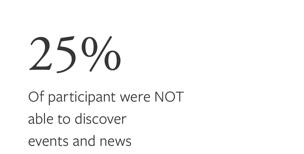
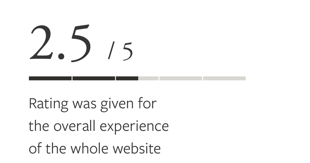
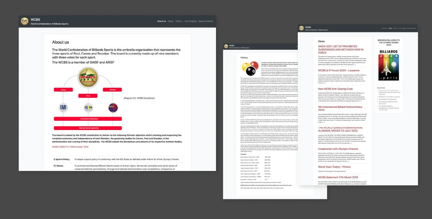
02. Affinity Mapping shows that there are 3 major pain points (swipe left to see the next pain point)
-
![]()
Pain point 1: unreliable first impression
Users were skeptical once on the landing page, due to the outdated logo and visual design. And they were unsure what this website is about.
-
![]()
Pain point 2: poor layout leading to low discoverability
Users complained that they didn’t know where to look and click, because there was too much distracting noise. They also had difficulties finding the things they wanted. In addition, they couldn’t see all three kinds of billiard events on one single page, and couldn’t filter the news on the news page.
-
![]()
Pain point 3: the content is text-heavy and boring
Users found it difficult to understand the content without billiard-related background. They also had no interest in reading the articles.
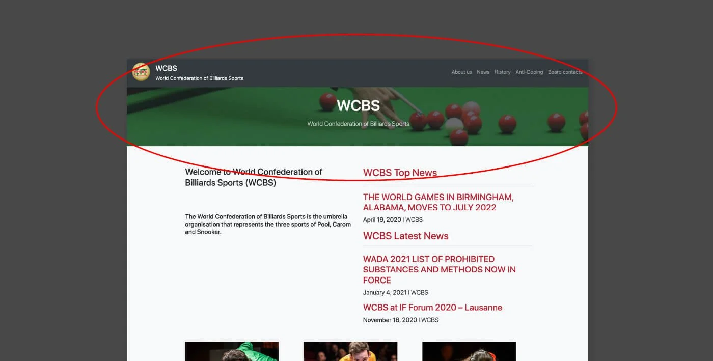
Summary of
the user’s needs on the current website
When the users get on the WCBS website for the first time, they need to trust this website, enjoy using it and find interesting content. Because currently they are skeptical about the outdated visuals and not clear what this website is, have difficulty navigating the site, and find it boring.
Marketing Research Insights from the Client
We were fortunate to get insights from both internal interviews with the key stakeholders and external input. The interviews were conducted to determine their top challenges and opportunities.
1. There is a lack of unity in the purpose of WCBS outside of Olympic aspirations.
WCBS is united by 3 independent federations aiming to bring Billiards into Olympic Games. But, it’s lack of structure and unity across the 3 federations — it doesn’t manage events or activities; and it has no governance of professional players.
2. WCBS is unknown or irrelevant to to their audience.
WCBS lack of activities, news and communications. A lot people know about its federations, while few people know about WCBS.
Generate Insights
Aligning user insights and business goals
Based on the research and the generated insights above, we developed 3 main design principles as a reference to design a better user experience.
Turning broad concepts to UX solutions
Brainstorming and deciding main features for the launch phase
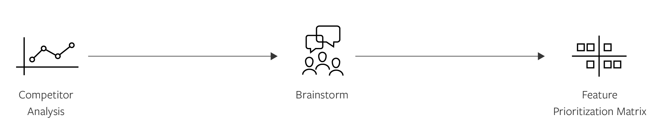
The current website didn’t have much billiard-related content to attract the users. Therefore, we started it by researching competitors’ benchmarks. Then we brainstormed the potential features and used Feature Prioritization Matrix to decide the main features for the launch phase, based on the project’s scope and timeline.

Design
AI and Design Exploration
After the client approved the key features, I started structuring the content on the sitemap. Then I sketched the hi-level design on paper, which helped me generate ideas about the arrangement of UI, functional elements, and interactive behaviors.
Current Sitemap
New Sitemap
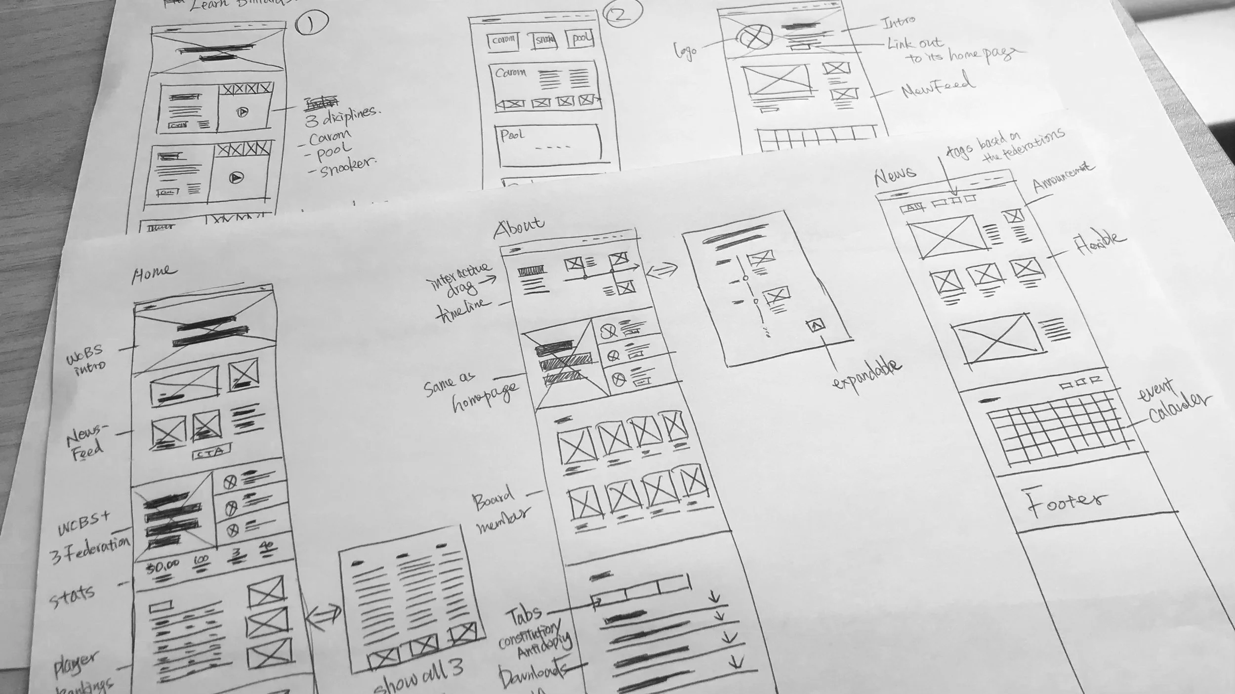
Sketches
1st iteration on the low fidelity wireframe
I gathered feedback from the design team on the low-fi wireframes. Below are some of the main feedback.
Make it visually exciting
WCBS wants to drive the excitement of billiards to a younger generation. Its overall feeling should be welcoming, modern, and respectful. I explored different designs on the key sections based on their new brand identity.
Adapted client’s changes and 2nd iteration
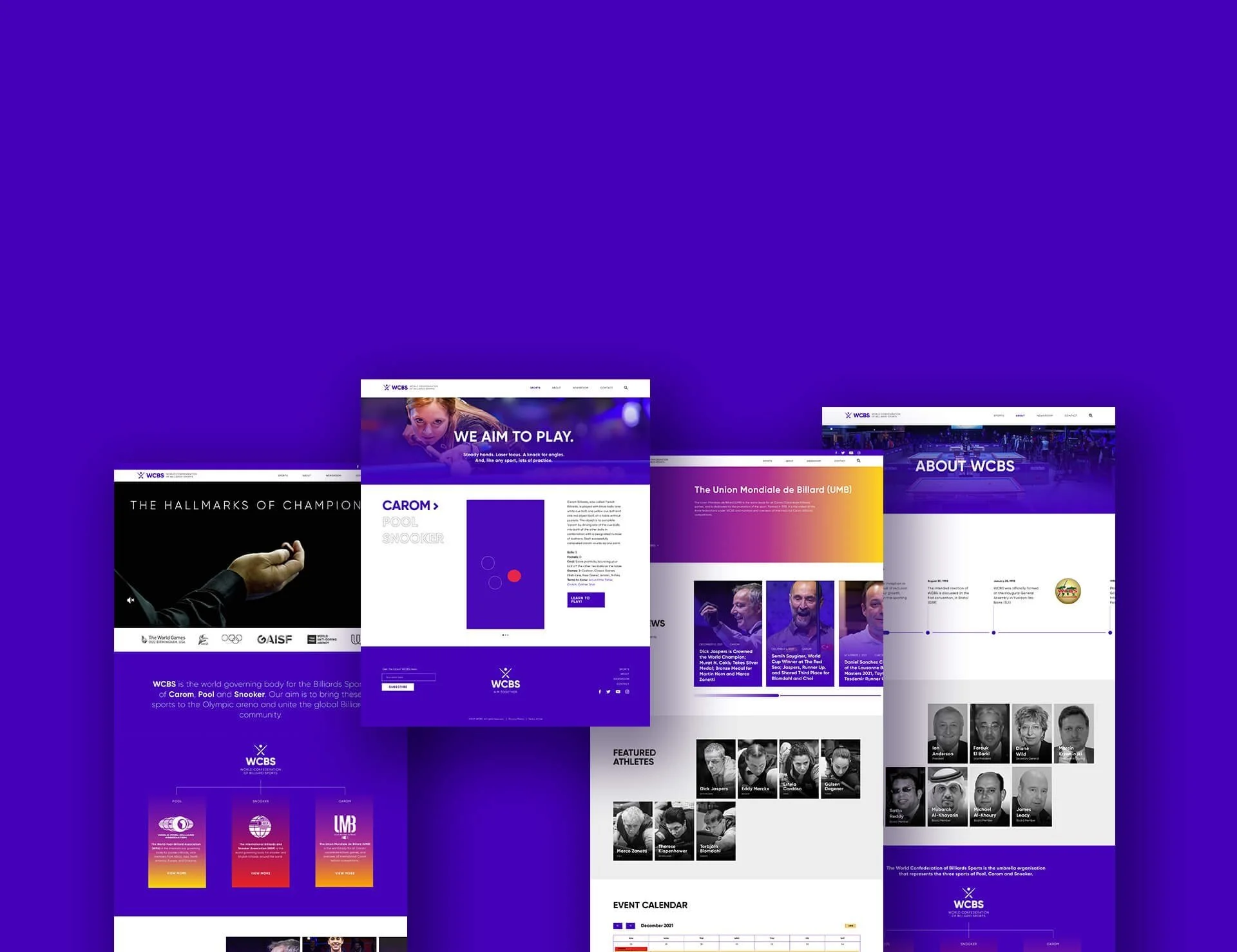
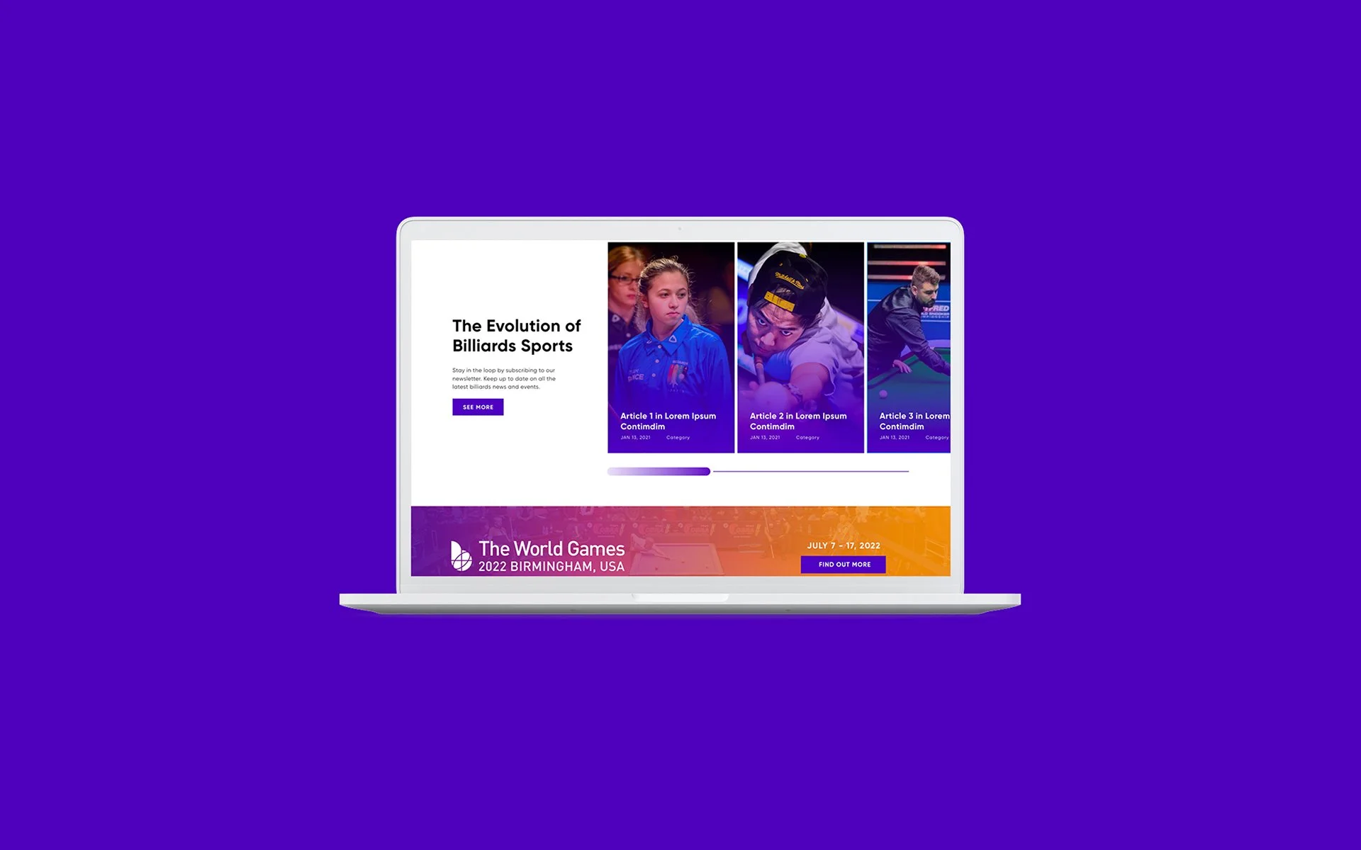
Introducing New WCBS Website
Improved First Impression
Before
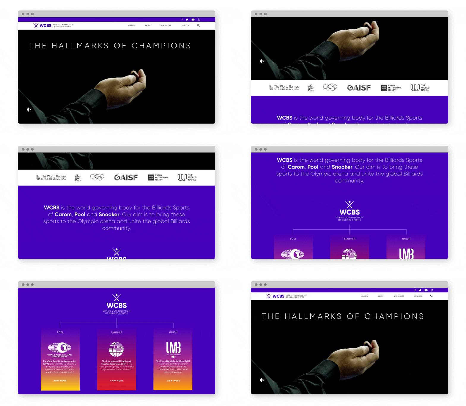
The users are skeptical about this website at the first sight, because the visuals are outdated and they are not clear what this website is.
After
Redesigned WCBS logo and its visuals to make WCBS trustworthy and memorable. Use a branded video to attract the users, followed by a clear statement of WCBS and diagram of its relationship with the three federations.
Improved UI Design
Increase Clarity
Before
Users didn’t know where to look at and click because there were too many distracting visual elements. And some languages are confusing.
After
Improved the information hierarchy and visual hierarchy. Use simple language and keep UI pattern consistent.
Increase Use of Efficiency
Before
Events were difficult to find and couldn’t view all three kinds of billiards on one page. There was no filter on the News.
After
Reworked the navigation and information architecture. Improved the visibility of Events section and provided personalization. Added filter search on the News section.
Add New Content
Before
There was very limited contents and they were not interesting to the users.
After
Added new contents that users are looking for and are interested in — billiard news, how to play billiards, media room and players highlights.
Takeaways
It was the first time I took ownership of the design process. I needed to step out of my comfort zone by communicating autonomously with the teammates and presenting my designs to the client. During the whole project, I have improved my communication skill and storytelling skill. I learnt that these skills are important and will keep improving these.
A good designer is flexible and fluid when challenges happen. One main challenge of this project was that client couldn’t provide the essential resources for certain parts of the website during the final design stage. That means some design needed to be changed and removed.
Potential Next Steps
Since this is the first stage of the redesign, the aim is to solve some current problems and new branding visuals. But I will explore more UI patterns on the next stage.
Add more event information to guide users to the next step if they are interested, such as live stream website or ticket website.
Continuously get more user feedback on the current live site.
NEXT PROJECT
Designing a Lead-gen Landing Page for Clinical trial professionals quickly find the Medidata solutions
Medidata, UX / UI